Element Properties
In addition to the properties that are set during element configuration via the wizards, there are other properties that are available to be changed via the properties pane in design mode.
Layout Properties[edit | edit source]
The following properties are valid for most elements.

- Autosize – Determines whether or not the element should change size based on its contents in user mode. If some values for a label or barcode are longer or shorter than the previous values or designed size, then this allows the element to change size. Turn this off if you would like the text in an element to wrap.
- Autosize mode – Specifies whether the element should only grow to accommodate large values, or if it should also shrink when a smaller value is being used.
- Horizontal Anchor – Specifies in which direction the element should grow and shrink when the horizontal size is hanged by the autosize option. Anchoring the element on the left side will cause it to grow to the right. Anchoring the element on the center will cause it to grow to the left and right while remaining centered. Anchoring the element on the right side will cause it to grow to the left.
- Maximum size – Specifies the maximum size to grow to when autosize is enabled. A value of ‘0; 0’ means that there is no maximum size.
- Minimum size – Specifies the minimum size to shrink to when autosize is enabled. A value of ‘0; 0’ means that there is no minimum size.
- Position and Size – These values can be changed via the properties pane, but it is much easier to just resize the element or drag it to a new position with the pointer.
- Vertical Anchor – Specifies in which direction the element should grow and shrink when the vertical size is changed by the autosize option. Anchoring the elementon the top will cause it to grow ownward. Anchoring the element on the center will cause it to grow both up and own while remaining centered. Anchoring the element on the bottom will cause it to grow upward.
Appearance Properties[edit | edit source]
- Background color – Changes the background color of the selected element or coversheet.
- Border style – Changes whether or not the element has a border, and what type of border. A Fixed Single border is a small, thin, flat border. A Fixed 3D border is a beveled border like on windows style forms and buttons. Only applies to labels and text.
- Character(s) separating the text and value – By default this is a colon and then a space, but can be changed or removed entirely. Only applies to labels.
- Color – Allows for the color to be changed.
- Font – Allows for the font to be changed.
- Text – Allows the text to be changed for elements that are static.
- Text Alignment – Determines how the text should be aligned inside the borders of the element.
Coversheet Field Data Properties[edit | edit source]
These are only for display and cannot be changed via the properties pane. They give basic configuration information about the currently selected element. To change these properties you must either create a new element or right-click on the element and choose Edit so that the configuration wizard starts and the changes can be made there.
Data Properties[edit | edit source]
- Column – Specifies which column to get values from in the Data Source.
- Data Source – Specifies which Data Source to get values from.
- Move Next Record After Fill – Specifies whether or not to skip to the next record after populating the value for the element in question.
- Database Fill Order – Specifies the order in which the element should be populated in regards to other elements with the same Data Source. This can only be changed via the configuration wizards.
- Synchronize on Fill – Only available for elements populated by a Data Source, or selected from a Data Source. When two or more elements with the same Data Source both have Synchronize on Fill enabled, the fill functionality changes to synchronize the two or more elements. So selecting or populating a value from a record in a Data Source for one element, would cause all the synchronized elements’ values to change to their corresponding column values of the same record.
Design Properties[edit | edit source]
The only design property is the Name property which is an internal name used by elements to reference each other. For instance, a Data Source with the name of ‘BindingSource1’ is referenced by a label or barcode whose values are populated by it.
Miscellaneous Properties[edit | edit source]

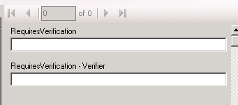
- Use Verifier – This is used for elements where the value will be input by hand. It adds another level of verification when inputting values by requiring the value to be input twice. When setting this option to True, it causes SimpleCoverSheet to create a second input box in User Mode. If this second box’s value is not the same as the first box’s value then you will not be able to print. The image shows User Mode configured with an element named RequiresVerification with the Use Verifier option set to true.